Retail / Print
Pisiffik Non-Food
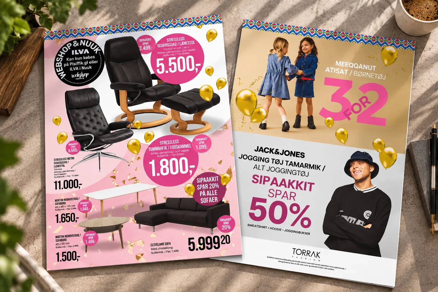
A weekly non-food retail publication bringing multiple brands, product categories and promotional messages together in a flexible, production-ready design system.
Bring multiple brands, product categories and promotional messages together in one weekly publication without losing clarity or brand identity.
I develop the page layouts, visual direction and production system for the non-food section across recurring and seasonal editions.
The system supports a high-volume weekly publication across multiple concepts and brands while keeping the output structured and production-ready.
Description
A weekly non-food retail publication bringing multiple brands, product categories and promotional messages together in a flexible, production-ready design system.
The assignment
I have worked with Pisiffik’s non-food communication for almost 13 years, and it still makes up the largest part of my day-to-day design work.
The non-food section is published weekly as part of Pisiffik’s retail newspaper. A typical edition is around 10 pages, with larger editions produced around major retail moments such as Christmas, Easter and Pisiffik’s birthday.
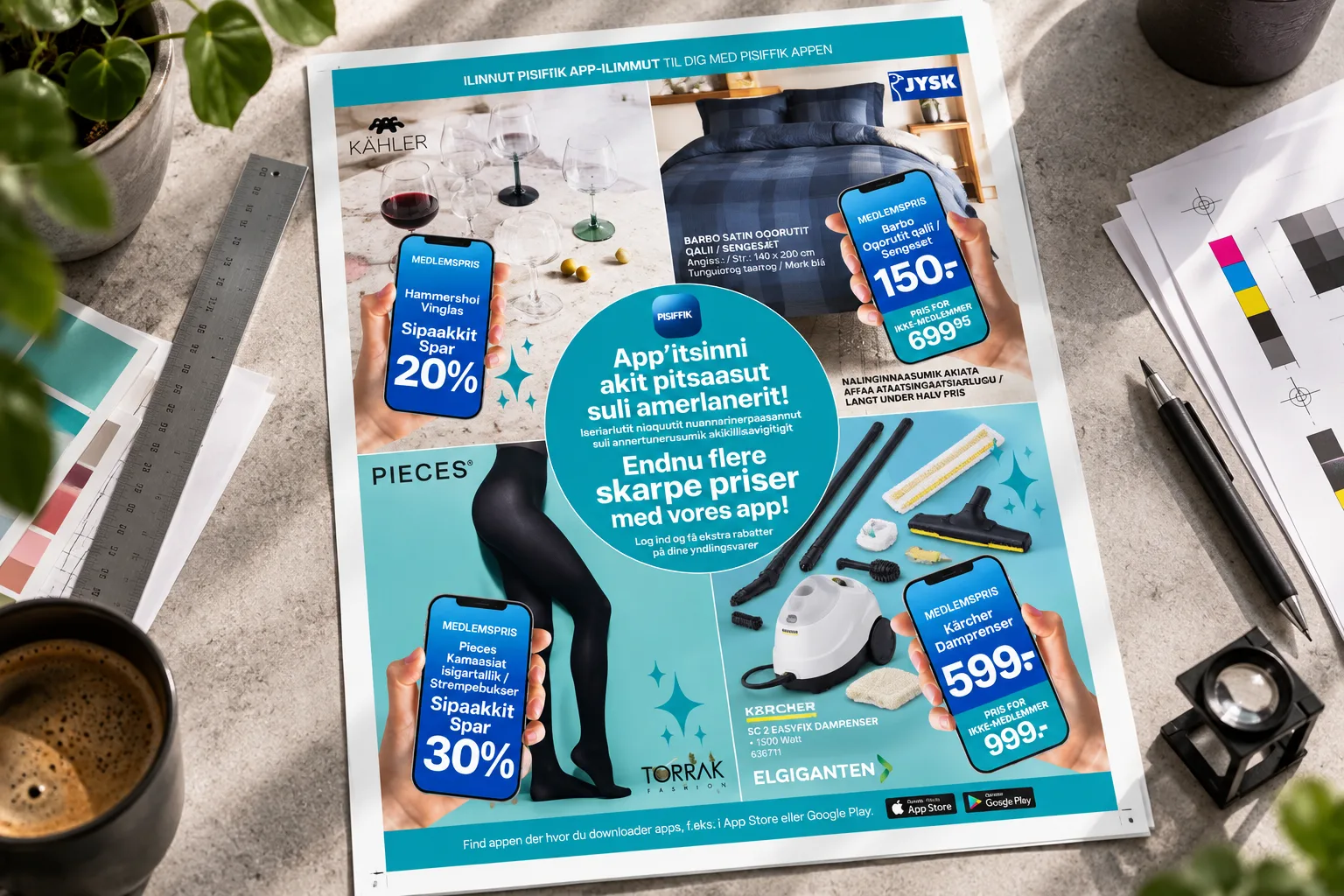
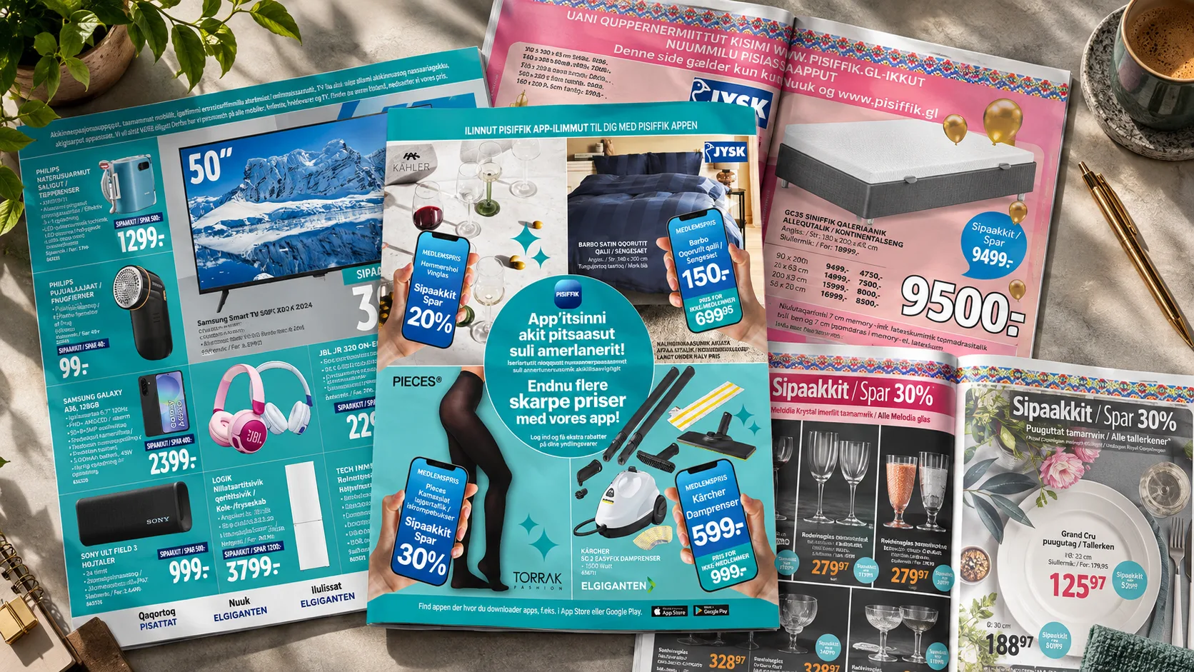
The publication brings together multiple concepts and brands, including Pisattat, Torrak Fashion, Elgiganten, JYSK, ILVA and Pisiffik itself.
My role
I am responsible for the first and most design-intensive part of the production process: developing the page layouts and establishing the visual expression of each section before the material moves into proofreading and final production.
My work includes:
- Page layout and composition
- Typography and hierarchy
- Product and information placement
- Price and promotional structures
- Campaign graphics
- Front pages and section openers
- Seasonal visual direction
- Ongoing development of the production system
Product images, prices and copy are supplied by the sales managers responsible for the individual concepts. After my part of the process is complete, colleagues take over proofreading and final print-ready production. Communication and approval are handled through my Creative Director and the Marketing Manager, who approves the final material before print.
One newspaper. Multiple brands.
The challenge is not to make every section look the same. It is to make different concepts work together inside one publication without losing their individual identities.
I build each concept as its own section and bring the individual sections together at the end of the process.
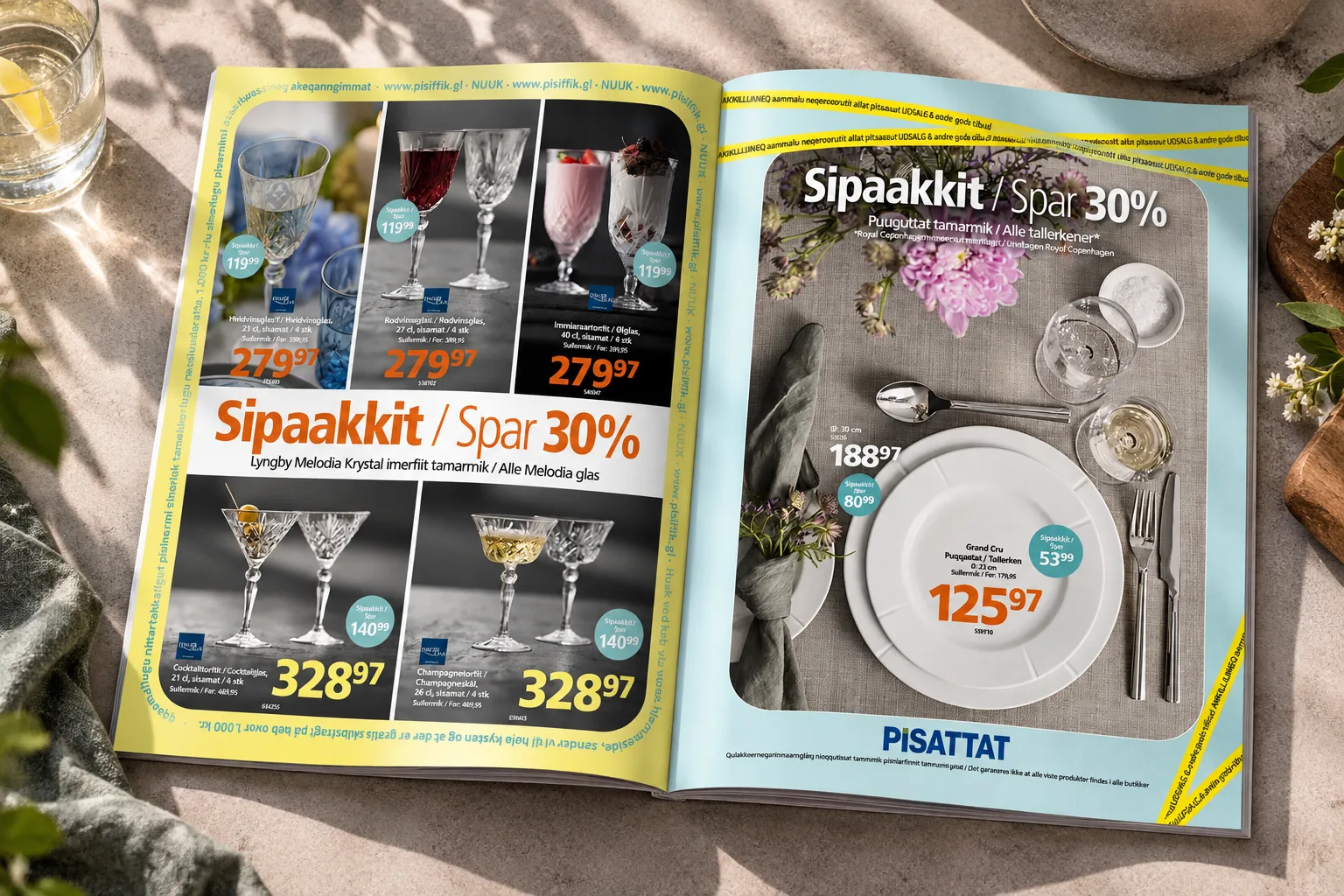
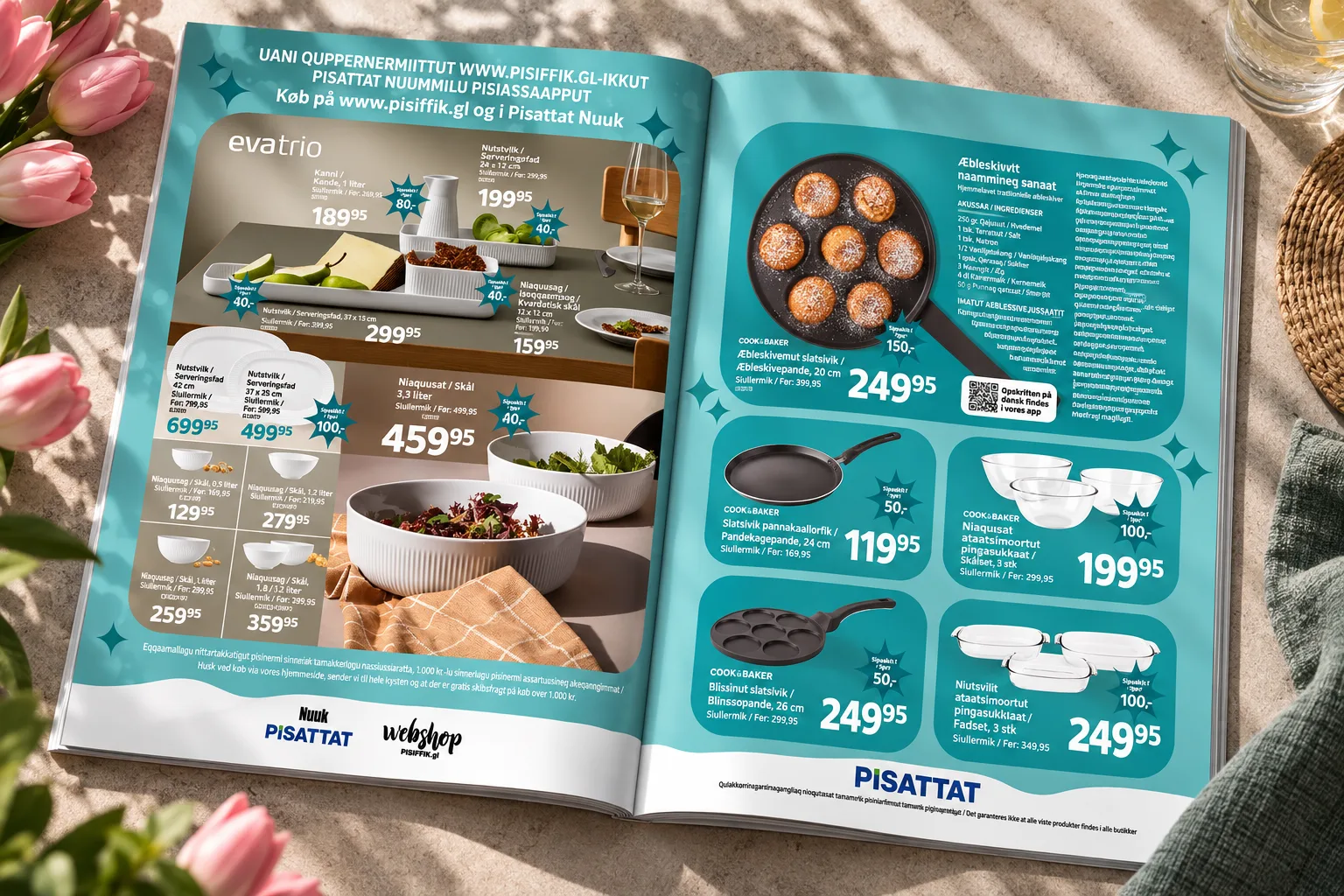
JYSK, Elgiganten and ILVA follow their established brand systems and design guidelines, while Torrak Fashion and Pisattat are concepts where I have developed the layout systems myself.
The result is a publication where different visual languages can sit side by side while still feeling structured and commercially coherent.
A system built for volume
Over time, I have developed the production system used for the non-food pages.
It includes fixed grids, price structures, recurring page formats, typography sizes, promotional elements and layout principles. The system is designed to make a large amount of product and pricing information easier to structure and quicker to produce without losing visual hierarchy.
The creative part of the process is primarily in the page composition and visual direction. Product images, texts and prices then have to fit into a system that is clear, consistent and easy to maintain.
Designing for the moment
The standard system also needs to be flexible enough to change when the retail calendar demands it.
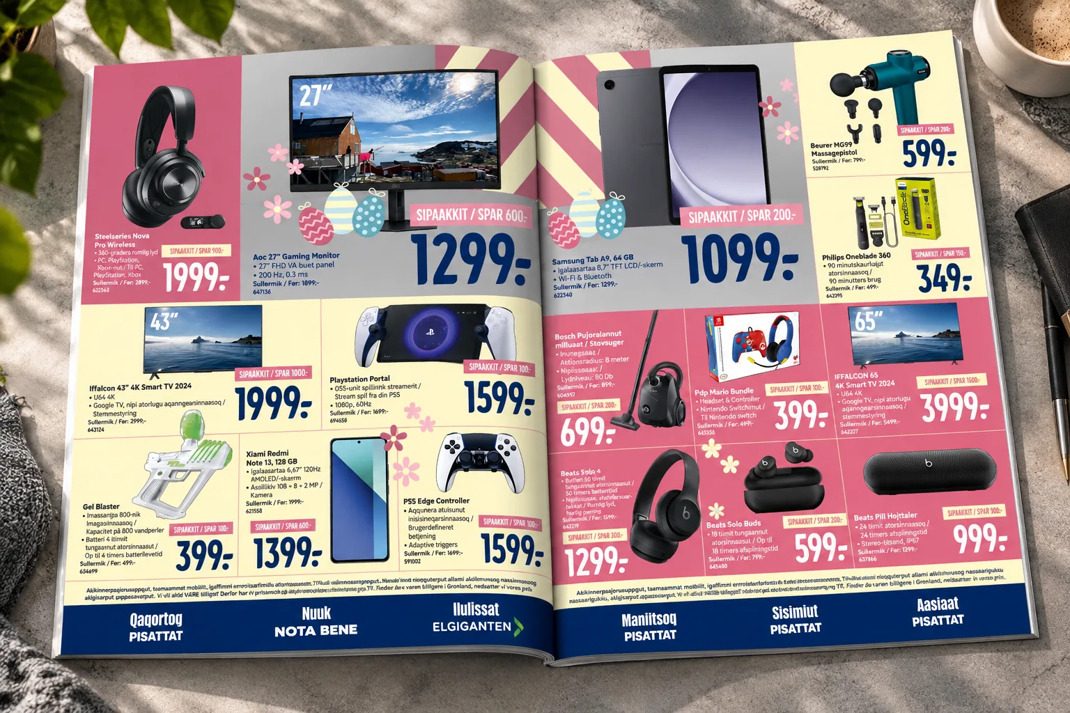
For major events such as Christmas, Easter and Pisiffik’s birthday, I adapt the visual expression of the newspaper so the editions feel distinct from the regular weekly output.
These seasonal versions require the same production discipline as the standard pages, while allowing more room for a different mood, colour direction and campaign expression.
Planning around Greenland
The production workflow is planned well ahead of publication.
From receiving the material to sending the pages to proofreading, the normal production window is around two weeks. Because printed newspapers need to be shipped to Greenland by sea around three months before publication, the overall process can be planned significantly earlier than a comparable retail publication with local distribution.
That long lead time makes structure and planning essential. Pages and concepts are often developed at different times, late changes can affect the visual direction, and the full picture only comes together once the individual sections are assembled.
Keeping control of complexity
For me, the strongest part of this work is not any single page. It is the ability to keep control of a large amount of information and many different visual requirements without losing the overall picture.
The system allows me to work across multiple concepts and brands, adapt to changing campaign directions and still deliver pages that are clear, consistent and ready for the next stage of production.
The assignment
I have worked with Pisiffik’s non-food communication for almost 13 years, and it still makes up the largest part of my day-to-day design work.
The non-food section is published weekly as part of Pisiffik’s retail newspaper. A typical edition is around 10 pages, with larger editions produced around major retail moments such as Christmas, Easter and Pisiffik’s birthday.
The publication brings together multiple concepts and brands, including Pisattat, Torrak Fashion, Elgiganten, JYSK, ILVA and Pisiffik itself.
My role
I am responsible for the first and most design-intensive part of the production process: developing the page layouts and establishing the visual expression of each section before the material moves into proofreading and final production.
My work includes:
- Page layout and composition
- Typography and hierarchy
- Product and information placement
- Price and promotional structures
- Campaign graphics
- Front pages and section openers
- Seasonal visual direction
- Ongoing development of the production system
Product images, prices and copy are supplied by the sales managers responsible for the individual concepts. After my part of the process is complete, colleagues take over proofreading and final print-ready production. Communication and approval are handled through my Creative Director and the Marketing Manager, who approves the final material before print.
One newspaper. Multiple brands.
The challenge is not to make every section look the same. It is to make different concepts work together inside one publication without losing their individual identities.
I build each concept as its own section and bring the individual sections together at the end of the process.
JYSK, Elgiganten and ILVA follow their established brand systems and design guidelines, while Torrak Fashion and Pisattat are concepts where I have developed the layout systems myself.
The result is a publication where different visual languages can sit side by side while still feeling structured and commercially coherent.
A system built for volume
Over time, I have developed the production system used for the non-food pages.
It includes fixed grids, price structures, recurring page formats, typography sizes, promotional elements and layout principles. The system is designed to make a large amount of product and pricing information easier to structure and quicker to produce without losing visual hierarchy.
The creative part of the process is primarily in the page composition and visual direction. Product images, texts and prices then have to fit into a system that is clear, consistent and easy to maintain.
Designing for the moment
The standard system also needs to be flexible enough to change when the retail calendar demands it.
For major events such as Christmas, Easter and Pisiffik’s birthday, I adapt the visual expression of the newspaper so the editions feel distinct from the regular weekly output.
These seasonal versions require the same production discipline as the standard pages, while allowing more room for a different mood, colour direction and campaign expression.
Planning around Greenland
The production workflow is planned well ahead of publication.
From receiving the material to sending the pages to proofreading, the normal production window is around two weeks. Because printed newspapers need to be shipped to Greenland by sea around three months before publication, the overall process can be planned significantly earlier than a comparable retail publication with local distribution.
That long lead time makes structure and planning essential. Pages and concepts are often developed at different times, late changes can affect the visual direction, and the full picture only comes together once the individual sections are assembled.
Keeping control of complexity
For me, the strongest part of this work is not any single page. It is the ability to keep control of a large amount of information and many different visual requirements without losing the overall picture.
The system allows me to work across multiple concepts and brands, adapt to changing campaign directions and still deliver pages that are clear, consistent and ready for the next stage of production.