Brand Communication / Environmental
Fair Fitness
A seven-year design partnership focused on creating a consistent visual experience across Fair Fitness's 18 centres on Zealand.
Create a recognisable visual experience across 18 centres while adapting the identity to different physical spaces and production needs.
I became the main client contact and have handled graphic development, artwork, supplier coordination and delivery from brief to finished material.
The collaboration has continued since 2019 and the visual system is now applied across Fair Fitness' 18 centres on Zealand.
Description
A seven-year design partnership focused on creating a consistent visual experience across Fair Fitness's 18 centres on Zealand.
The brief
In 2019, Fair Fitness came to the company I work for with a clear challenge: their centres had accumulated many different types of graphic material without a consistent visual line.
I became the main point of contact for the customer and have since helped streamline and further develop the visual identity used across their centres.
The goal is simple: when a member moves from one Fair Fitness location to another, the environment should still feel familiar and recognisably Fair Fitness.
My role
I handle the graphic production for Fair Fitness’s centres from brief to delivery.
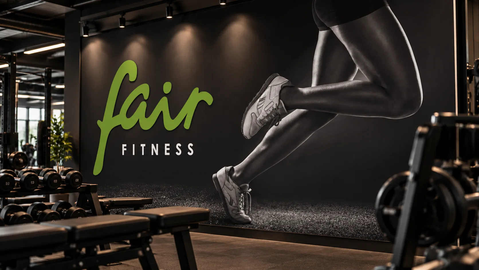
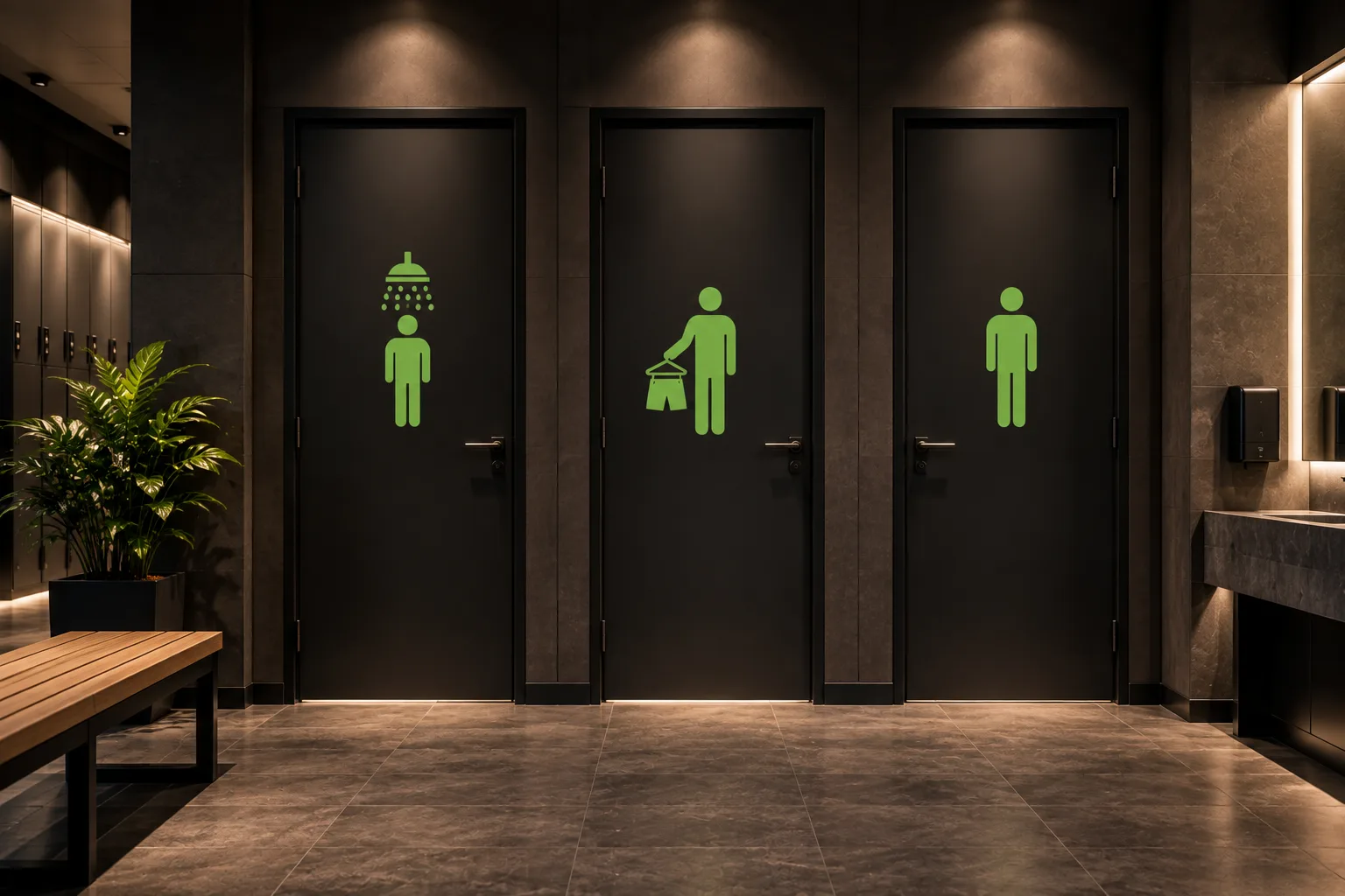
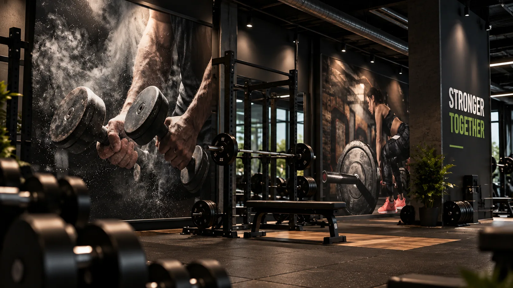
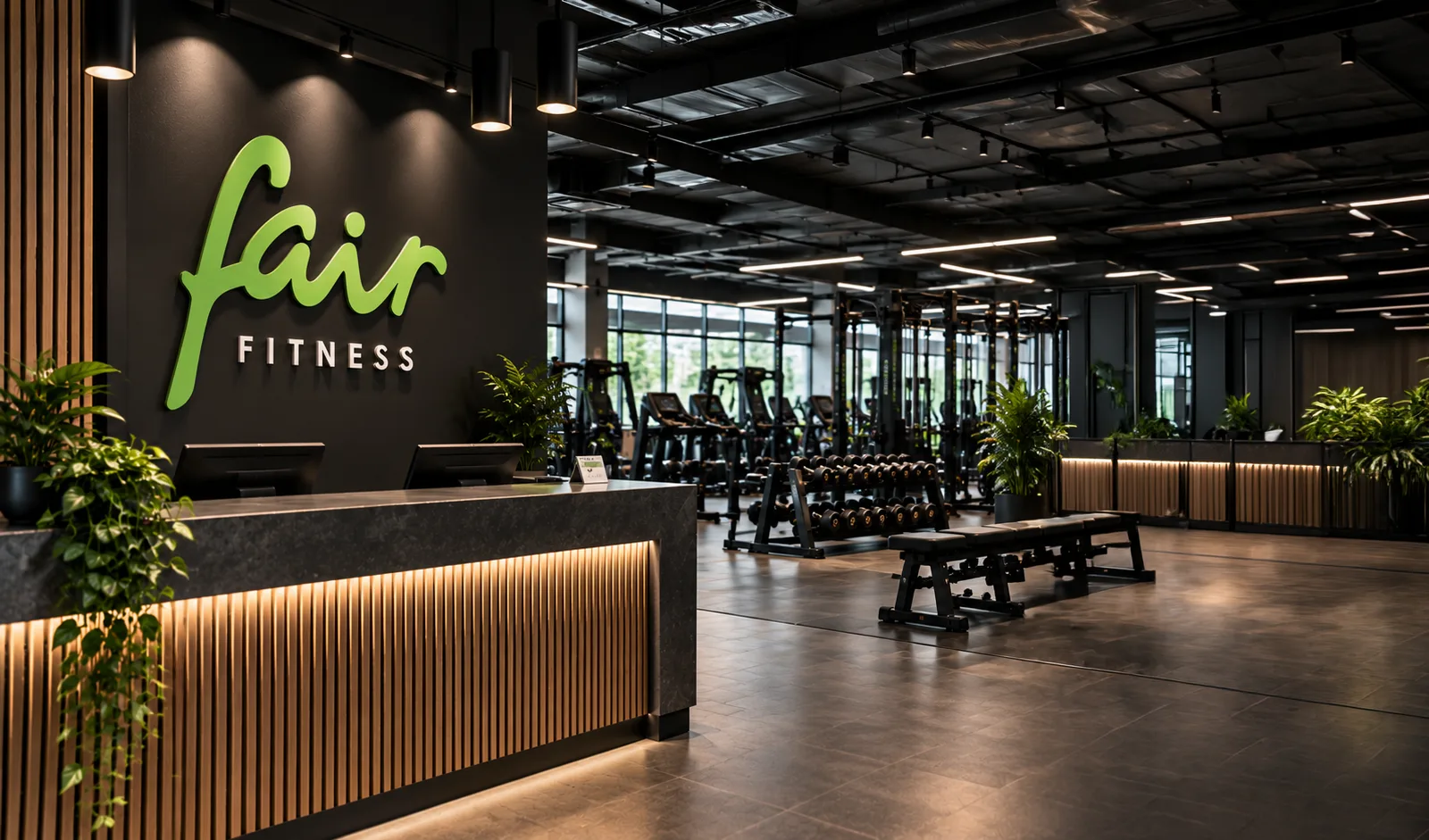
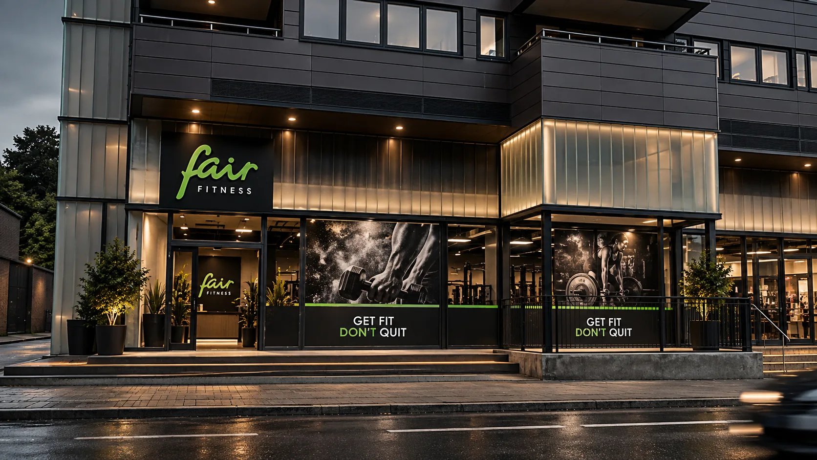
My work covers wall art, logo signage, light walls, posters, infographics, centre signage, changing-room and toilet communication, and large-format print preparation.
I also handle corrections, final print files, supplier coordination and the administration behind delivery to the individual centres. I work directly with Fair Fitness’s two centre managers and manage the graphic process independently from the first brief to finished material.
One identity across 18 centres
The project is not built around individual campaigns. It is about creating consistency.
Fair Fitness currently has 18 centres across Zealand, and the visual material needs to work across different physical spaces without losing the same recognisable identity.
Over time, I have helped create that red thread by applying and further developing the identity across different scales and touchpoints — from large wall graphics and illuminated branding to smaller functional signs and information graphics.
Designing for the environment
Much of the work is about translating a visual identity into a physical space.
Some assignments are straightforward production tasks, such as correcting supplied imagery for large-format printing. Others require layout, composition or adaptation of the identity to a specific part of a centre.
The challenge is to make the graphics feel integrated with the architecture and the way members move through the space, rather than simply placing individual pieces of artwork on walls.
From brief to finished material
A typical assignment starts with a practical need: a new centre is opening, an existing centre is being renovated, or a particular area needs new graphics.
I receive the brief, develop or prepare the material, handle corrections, create print-ready files and coordinate production with the relevant suppliers.
That means the customer can hand over an assignment and trust that it is carried through the full process without them having to manage the individual production steps themselves.
A long-term design partnership
After seven years, the collaboration is still active whenever Fair Fitness opens a new centre or renovates an existing one.
For me, the value of the project lies in the continuity: knowing the customer, understanding the visual system, keeping an overview of the material and taking responsibility for the process from brief to finished delivery.
It is an example of the role I enjoy most in design — combining the graphic work with ownership, structure and reliable customer service.
The brief
In 2019, Fair Fitness came to the company I work for with a clear challenge: their centres had accumulated many different types of graphic material without a consistent visual line.
I became the main point of contact for the customer and have since helped streamline and further develop the visual identity used across their centres.
The goal is simple: when a member moves from one Fair Fitness location to another, the environment should still feel familiar and recognisably Fair Fitness.
My role
I handle the graphic production for Fair Fitness’s centres from brief to delivery.
My work covers wall art, logo signage, light walls, posters, infographics, centre signage, changing-room and toilet communication, and large-format print preparation.
I also handle corrections, final print files, supplier coordination and the administration behind delivery to the individual centres. I work directly with Fair Fitness’s two centre managers and manage the graphic process independently from the first brief to finished material.
One identity across 18 centres
The project is not built around individual campaigns. It is about creating consistency.
Fair Fitness currently has 18 centres across Zealand, and the visual material needs to work across different physical spaces without losing the same recognisable identity.
Over time, I have helped create that red thread by applying and further developing the identity across different scales and touchpoints — from large wall graphics and illuminated branding to smaller functional signs and information graphics.
Designing for the environment
Much of the work is about translating a visual identity into a physical space.
Some assignments are straightforward production tasks, such as correcting supplied imagery for large-format printing. Others require layout, composition or adaptation of the identity to a specific part of a centre.
The challenge is to make the graphics feel integrated with the architecture and the way members move through the space, rather than simply placing individual pieces of artwork on walls.
From brief to finished material
A typical assignment starts with a practical need: a new centre is opening, an existing centre is being renovated, or a particular area needs new graphics.
I receive the brief, develop or prepare the material, handle corrections, create print-ready files and coordinate production with the relevant suppliers.
That means the customer can hand over an assignment and trust that it is carried through the full process without them having to manage the individual production steps themselves.
A long-term design partnership
After seven years, the collaboration is still active whenever Fair Fitness opens a new centre or renovates an existing one.
For me, the value of the project lies in the continuity: knowing the customer, understanding the visual system, keeping an overview of the material and taking responsibility for the process from brief to finished delivery.
It is an example of the role I enjoy most in design — combining the graphic work with ownership, structure and reliable customer service.