Brand Identity / Editorial
FLID
A complete visual identity and editorial system for FLID, built around a compass-inspired logo and a design system made to work across print, digital and everyday communication.
Move FLID beyond a static anchor-based identity while keeping its maritime character and making the new system practical for everyday communication.
I developed the logo, visual identity, design manual and editorial system, and took responsibility for the ongoing graphic production.
The identity is still in use today, supported by a flexible editorial and communication system.
Description
A complete visual identity and editorial system for FLID, built around a compass-inspired logo and a design system made to work across print, digital and everyday communication.
The brief
In 2020, Foreningen af Lystbådehavne i Danmark wanted a new visual direction that could better reflect the organisation and where it was heading.
The existing logo was built around an anchor. It was recognisable and clearly maritime, but the client felt that it also made FLID appear too fixed in place. The ambition was to create an identity that still felt rooted in the maritime world, while communicating movement, direction and development.
As part of the same project, I also took over the design and production of FLID’s member magazine, Flid og Fakta, which is published four times a year, as well as the wider graphic communication across the organisation.
From anchor to movement
The logo development was a long process, with around 10–12 directions explored together with the client before we arrived at the final solution.
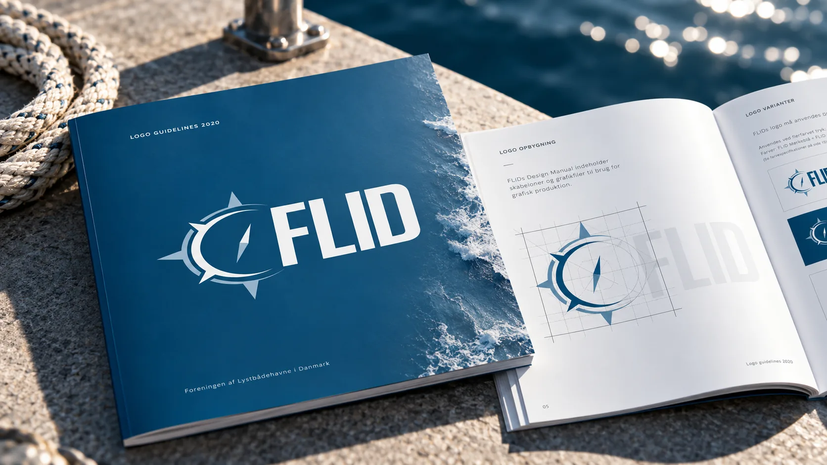
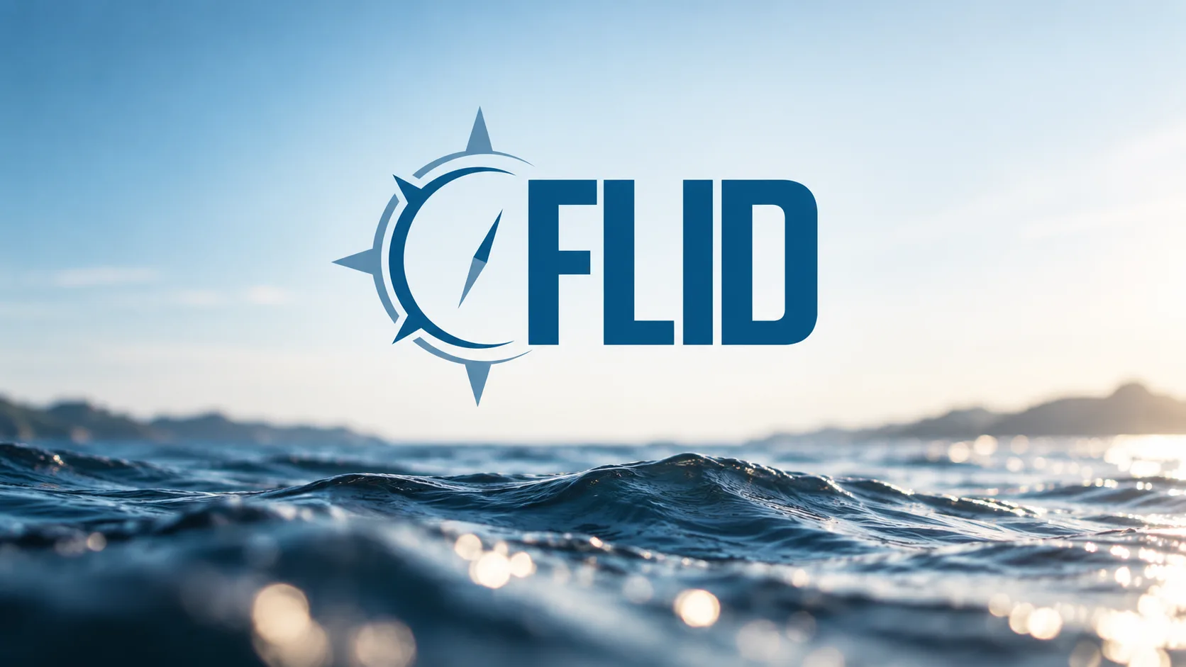
The maritime starting point stayed central throughout the process. The final logo is built around a compass, with the direction deliberately turned slightly away from true north. That small shift creates a sense of movement rather than a symbol that is simply fixed in one position.
The compass became the defining element of the new identity, representing direction, progress and course while giving FLID a strong maritime character.
Building a visual system
The logo was only the starting point.
I developed the visual identity and the design manual that defined how FLID should work across different formats and communication channels. The system established the logo variants, colour palette, typography, graphic elements and practical usage guidelines.
The manual was designed as a working tool rather than a presentation piece. It provided the templates and graphic assets needed for everyday production and made it possible for other designers to work within the identity while maintaining a consistent visual expression.
Flid og Fakta
Alongside the identity, I redesigned FLID’s existing member magazine, Flid og Fakta.
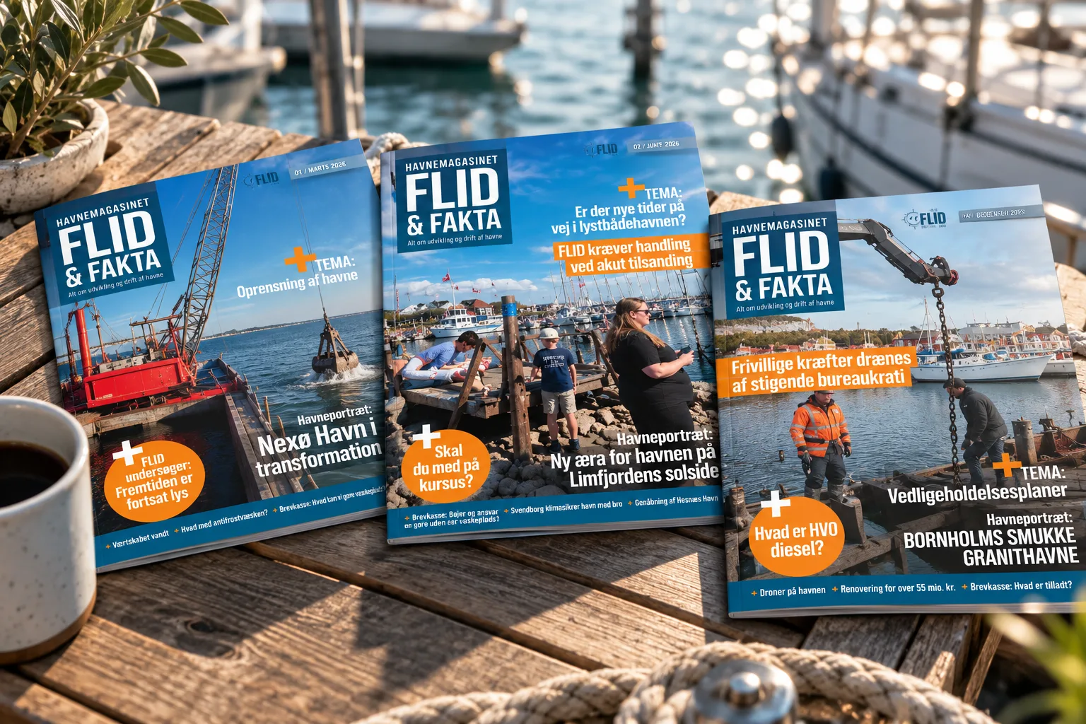
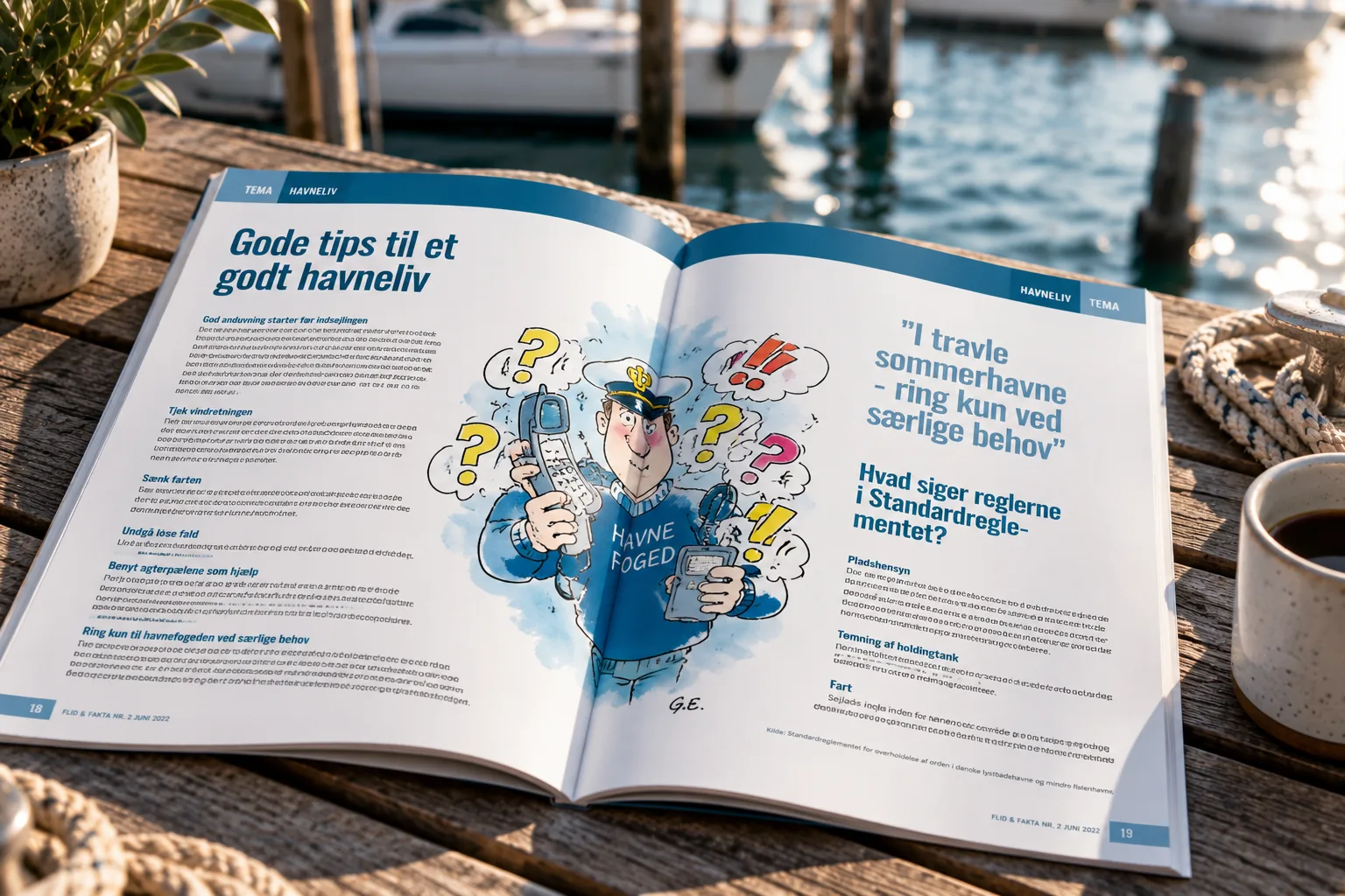
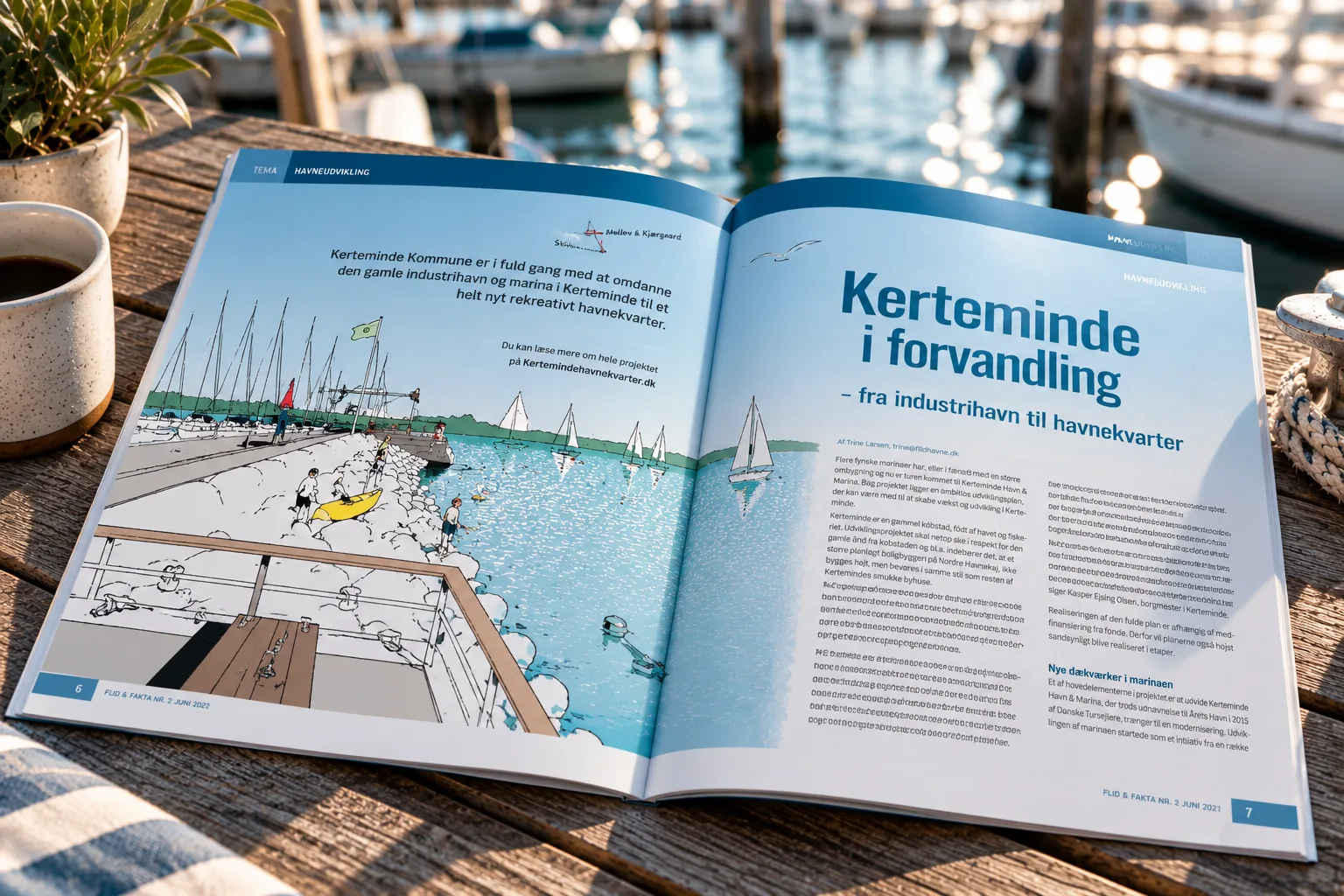
The challenge was to modernise the publication without making it feel disconnected from the magazine members already knew. I developed a clear layout system that brought greater consistency to typography, spacing, imagery and page composition while remaining flexible enough to handle different editorial formats.
The magazine is typically around 56 pages and is published four times a year.
I am responsible for the complete design and layout of the publication. Editorial content is supplied by FLID’s editor and other contributors, while photography, advertising material, printing and distribution involve external collaborators.
The layout system also made the magazine significantly easier and less time-consuming to produce from issue to issue.
One identity, many touchpoints
The identity was rolled out across both print and digital communication.
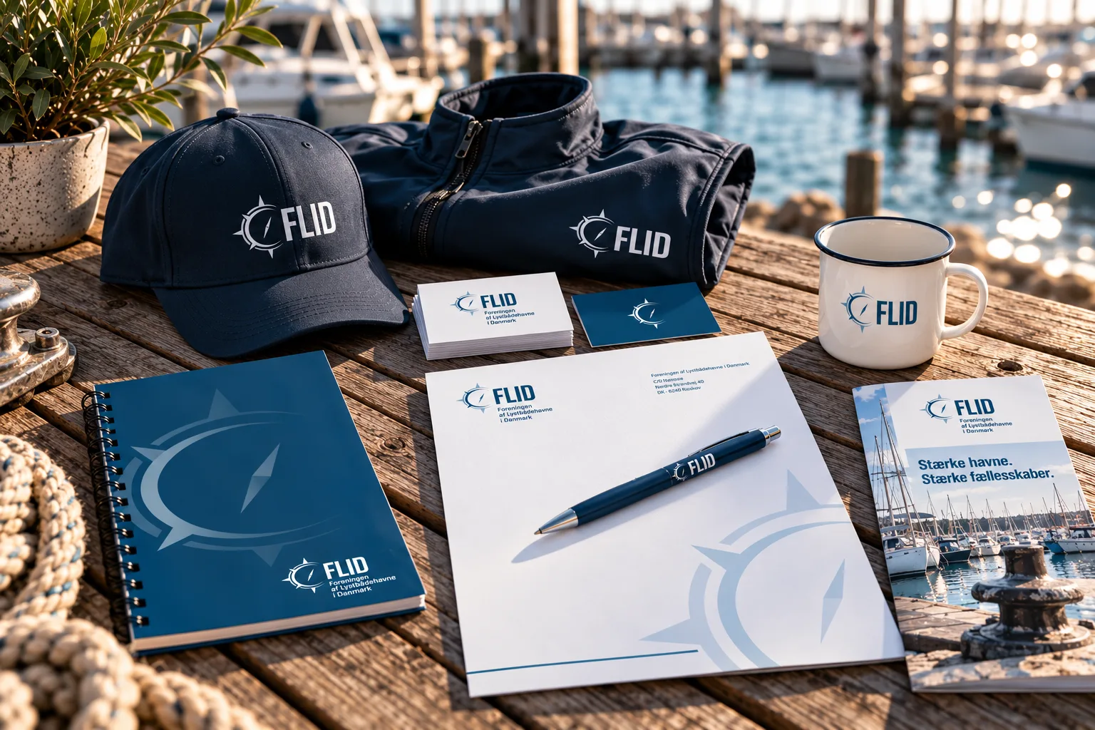
I have developed and produced everything from stationery, business cards, PowerPoint templates and email signatures to posters, roll-ups, clothing, promotional materials and website graphics.
The same visual system therefore had to work at very different scales and in very different contexts — from a small logo on a business card to a full magazine spread.
A long-term design partnership
What began as a logo and identity project has developed into an ongoing design partnership.
The identity is still in use today, and I continue to work with FLID on its graphic production. The project is a good example of how I approach identity work: not simply creating a logo, but building a practical visual system that can be used consistently and efficiently over time.
It also reflects the breadth of my work — from developing a brand identity from scratch to applying that identity across editorial, print, digital and physical communication.
The brief
In 2020, Foreningen af Lystbådehavne i Danmark wanted a new visual direction that could better reflect the organisation and where it was heading.
The existing logo was built around an anchor. It was recognisable and clearly maritime, but the client felt that it also made FLID appear too fixed in place. The ambition was to create an identity that still felt rooted in the maritime world, while communicating movement, direction and development.
As part of the same project, I also took over the design and production of FLID’s member magazine, Flid og Fakta, which is published four times a year, as well as the wider graphic communication across the organisation.
From anchor to movement
The logo development was a long process, with around 10–12 directions explored together with the client before we arrived at the final solution.
The maritime starting point stayed central throughout the process. The final logo is built around a compass, with the direction deliberately turned slightly away from true north. That small shift creates a sense of movement rather than a symbol that is simply fixed in one position.
The compass became the defining element of the new identity, representing direction, progress and course while giving FLID a strong maritime character.
Building a visual system
The logo was only the starting point.
I developed the visual identity and the design manual that defined how FLID should work across different formats and communication channels. The system established the logo variants, colour palette, typography, graphic elements and practical usage guidelines.
The manual was designed as a working tool rather than a presentation piece. It provided the templates and graphic assets needed for everyday production and made it possible for other designers to work within the identity while maintaining a consistent visual expression.
Flid og Fakta
Alongside the identity, I redesigned FLID’s existing member magazine, Flid og Fakta.
The challenge was to modernise the publication without making it feel disconnected from the magazine members already knew. I developed a clear layout system that brought greater consistency to typography, spacing, imagery and page composition while remaining flexible enough to handle different editorial formats.
The magazine is typically around 56 pages and is published four times a year.
I am responsible for the complete design and layout of the publication. Editorial content is supplied by FLID’s editor and other contributors, while photography, advertising material, printing and distribution involve external collaborators.
The layout system also made the magazine significantly easier and less time-consuming to produce from issue to issue.
One identity, many touchpoints
The identity was rolled out across both print and digital communication.
I have developed and produced everything from stationery, business cards, PowerPoint templates and email signatures to posters, roll-ups, clothing, promotional materials and website graphics.
The same visual system therefore had to work at very different scales and in very different contexts — from a small logo on a business card to a full magazine spread.
A long-term design partnership
What began as a logo and identity project has developed into an ongoing design partnership.
The identity is still in use today, and I continue to work with FLID on its graphic production. The project is a good example of how I approach identity work: not simply creating a logo, but building a practical visual system that can be used consistently and efficiently over time.
It also reflects the breadth of my work — from developing a brand identity from scratch to applying that identity across editorial, print, digital and physical communication.