Brand Identity / Logo Design
Daily
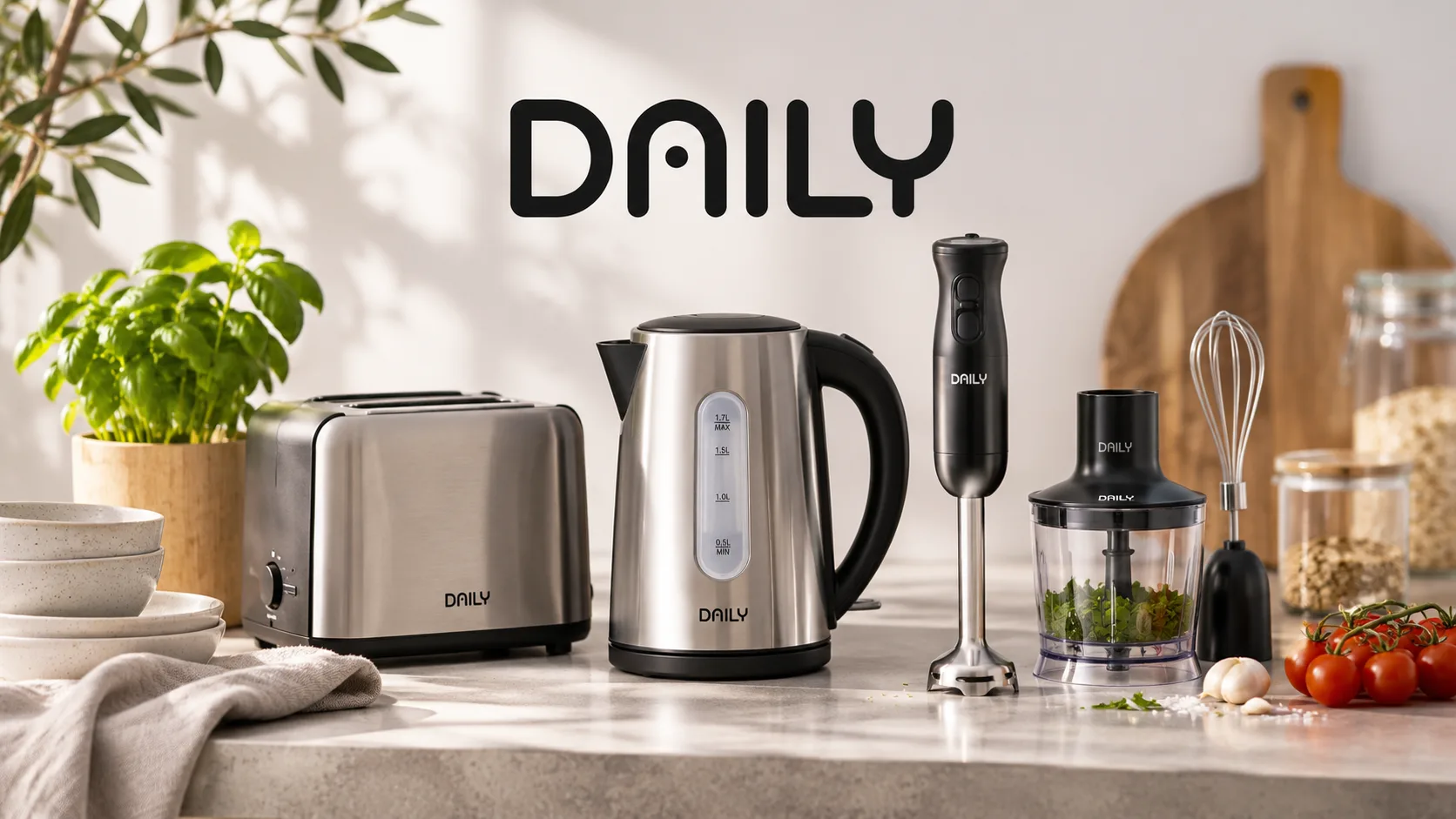
A distinctive wordmark for Daily, a private label by Din Isenkræmmer. The identity was designed to feel approachable and contemporary while working across a broad range of everyday products.
Create a modern, recognisable logo for a new kitchenware range that could extend across multiple product categories without feeling either budget or premium.
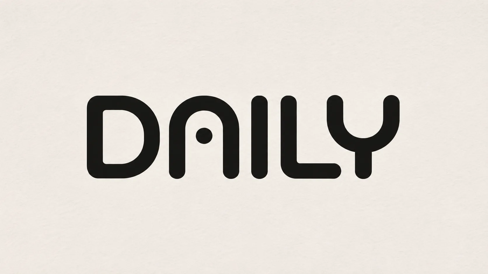
I developed the wordmark and adapted an existing typeface, refining the letterforms to create a distinctive rounded expression and a recognisable custom A.
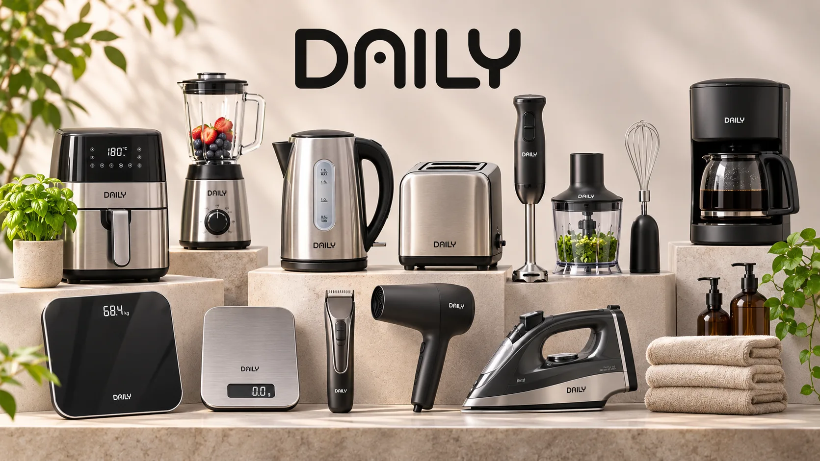
Approved in the first presentation, the logo became the identity for Daily products sold in Din Isenkræmmer stores. At the time of writing, it appears on 89 products in Holger's catalogue.
Description
A distinctive wordmark for Daily, a private label by Din Isenkræmmer. The identity was designed to feel approachable and contemporary while working across a broad range of everyday products.
The brief
In December 2024, I was commissioned through Lynge Olsen Group to develop a logo for Daily, a new private label for Din Isenkræmmer.
The logo was initially intended for a new kitchenware range, but it needed the flexibility to work across a much wider assortment over time — from kitchen utensils and appliances to home accessories and decoration. Daily also had to stand as an independent brand, separate from Din Isenkræmmer’s own identity.
The challenge was to find the right balance: a modern, Scandinavian expression that felt accessible and offered a sense of good value, without looking cheap or overly premium.
Exploring the right expression
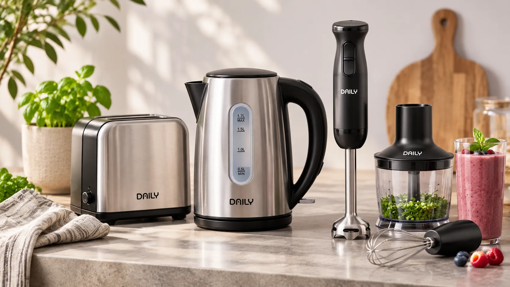
I explored eight different typographic directions and presented them in context on kitchen products. This allowed the client to assess not only the logos themselves, but also how each direction would work when applied to an actual product.
The selected direction was built around simplicity, rounded forms and a clear, recognisable wordmark. The aim was to create a brand that felt contemporary and approachable without taking itself too seriously.
A distinctive wordmark
Starting with an existing typeface, I modified the letterforms to create a more individual expression. The rounded shapes give the logo a softer, more relaxed character, while the tall proportions help it remain clear and recognisable.
The defining detail is the custom A. Its modified form gives the wordmark a distinctive feature without adding a separate symbol or unnecessary graphic elements.
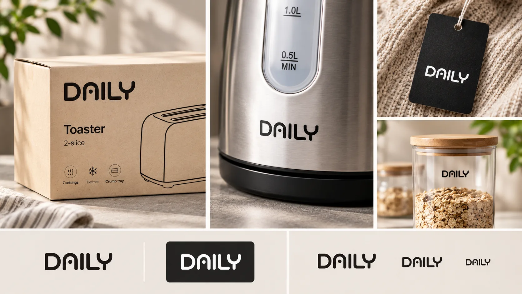
The result follows a simple principle: less is more. The logo has enough character to be recognised, while remaining uncomplicated and easy to read — even when reproduced at a small size.
Designed for everyday use
The logo was developed as a monochrome wordmark, with black and white as its only approved expressions. Keeping the identity free from additional colours and graphic elements makes it adaptable across different product types, materials, formats and production methods.
From kitchen appliances and utensils to storage and decoration, the logo is designed to sit naturally on very different everyday products while maintaining a consistent brand expression.
An identity in everyday use
The selected logo was approved in the first presentation and went on to become the identity for Daily. The brand is now used on products sold in many Din Isenkræmmer stores.
At the time of writing, Daily appears on 89 products in Holger’s product catalogue — a practical example of how a simple, distinctive wordmark can work across a broad and varied retail assortment.
The project is a focused example of my approach to logo design: understanding the commercial context, finding the essential visual idea and creating a mark that works in real use.
The brief
In December 2024, I was commissioned through Lynge Olsen Group to develop a logo for Daily, a new private label for Din Isenkræmmer.
The logo was initially intended for a new kitchenware range, but it needed the flexibility to work across a much wider assortment over time — from kitchen utensils and appliances to home accessories and decoration. Daily also had to stand as an independent brand, separate from Din Isenkræmmer’s own identity.
The challenge was to find the right balance: a modern, Scandinavian expression that felt accessible and offered a sense of good value, without looking cheap or overly premium.
Exploring the right expression
I explored eight different typographic directions and presented them in context on kitchen products. This allowed the client to assess not only the logos themselves, but also how each direction would work when applied to an actual product.
The selected direction was built around simplicity, rounded forms and a clear, recognisable wordmark. The aim was to create a brand that felt contemporary and approachable without taking itself too seriously.
A distinctive wordmark
Starting with an existing typeface, I modified the letterforms to create a more individual expression. The rounded shapes give the logo a softer, more relaxed character, while the tall proportions help it remain clear and recognisable.
The defining detail is the custom A. Its modified form gives the wordmark a distinctive feature without adding a separate symbol or unnecessary graphic elements.
The result follows a simple principle: less is more. The logo has enough character to be recognised, while remaining uncomplicated and easy to read — even when reproduced at a small size.
Designed for everyday use
The logo was developed as a monochrome wordmark, with black and white as its only approved expressions. Keeping the identity free from additional colours and graphic elements makes it adaptable across different product types, materials, formats and production methods.
From kitchen appliances and utensils to storage and decoration, the logo is designed to sit naturally on very different everyday products while maintaining a consistent brand expression.
An identity in everyday use
The selected logo was approved in the first presentation and went on to become the identity for Daily. The brand is now used on products sold in many Din Isenkræmmer stores.
At the time of writing, Daily appears on 89 products in Holger’s product catalogue — a practical example of how a simple, distinctive wordmark can work across a broad and varied retail assortment.
The project is a focused example of my approach to logo design: understanding the commercial context, finding the essential visual idea and creating a mark that works in real use.