Packaging
Simple Life by Trope
A playful six-product snack series created to stand out as spot products in Rema 1000 and appeal to a younger audience through bold colour, character and humour.
Create a six-product snack series with enough shelf impact to stand out as spot products while still reading as one family.
I developed the naming, visual expression, characters, packaging layouts and final production artwork in collaboration with the client.
The six-product series was produced and reached Rema 1000 stores across Denmark.
Description
A playful six-product snack series created to stand out as spot products in Rema 1000 and appeal to a younger audience through bold colour, character and humour.
The brief
Simple Life by Trope wanted a completely new and playful take on a range of snacks covering banana chips, honey-roasted peanuts, spicy rice cakes, crunchy peanut balls, crunchy corn and potato sticks, and cheese-flavoured chips.
The products were developed as spot products for Rema 1000, so the packaging needed to be highly visible in-store and appeal to a younger audience. The ambition was to create bags that were difficult to ignore — the kind of products parents might find hard to leave behind.
My role
I developed the graphic expression for the entire six-product series in close collaboration with the client.
My role covered the project from early naming and visual development through to final production artwork:
- Product naming developed together with the client
- Overall visual expression and tone of voice
- Character development and illustration
- Typography and colour selection
- Packaging design and layout across six variants
- Final artwork and print-ready files
The client handled proofreading, sales, distribution and the subsequent marketing of the products.
The goal was simple: make the snacks impossible to overlook.
One series. Six personalities.
The product names became the starting point for the characters and visual worlds.
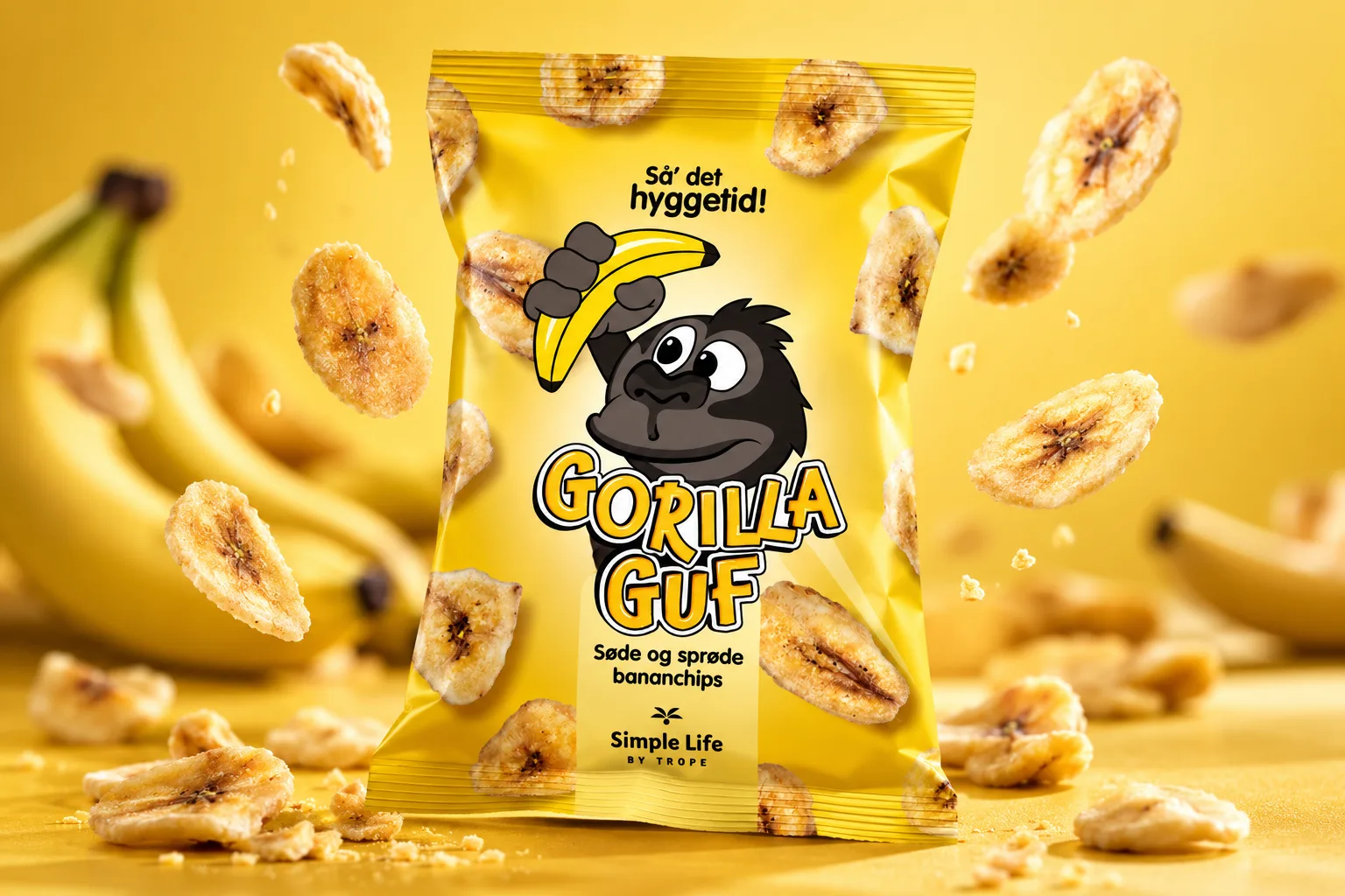
Gorilla Guf became a playful gorilla holding a banana.
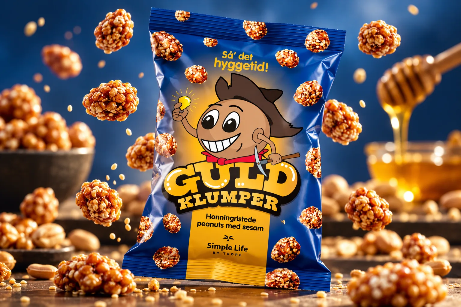
Guldklumper turned into a gold prospector searching for his next find.
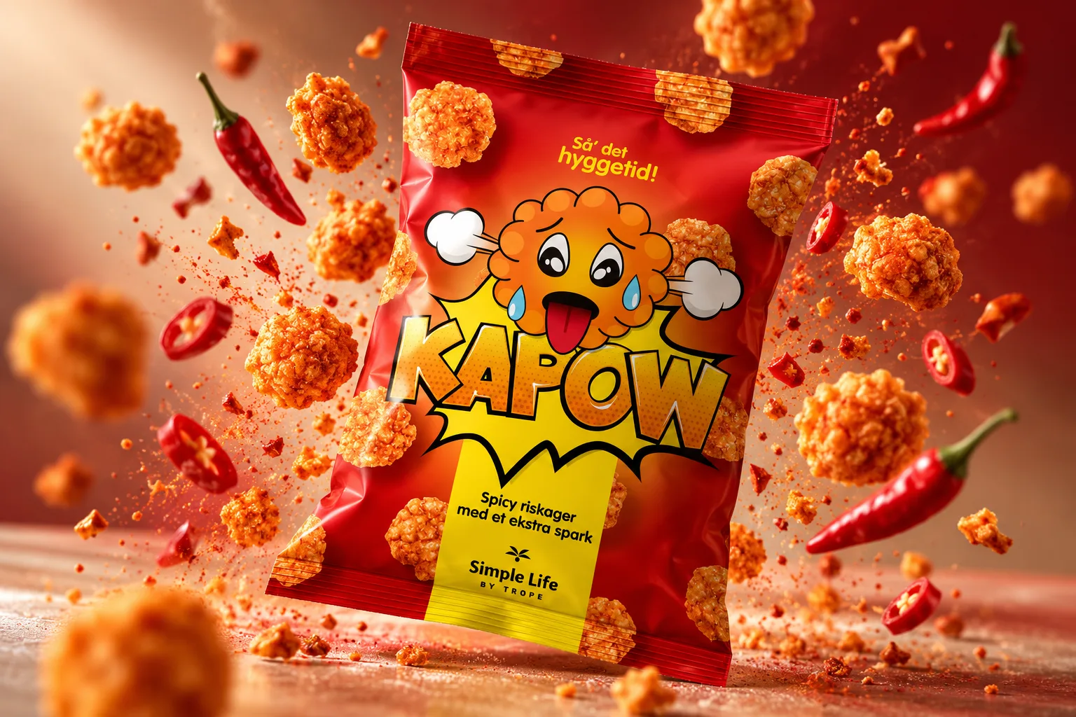
Kapow! was built around an overheated rice-cake character reacting to the spicy kick.
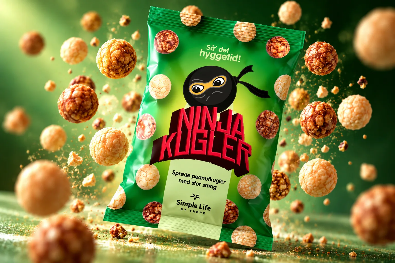
Ninja Kugler naturally became a round ninja character.
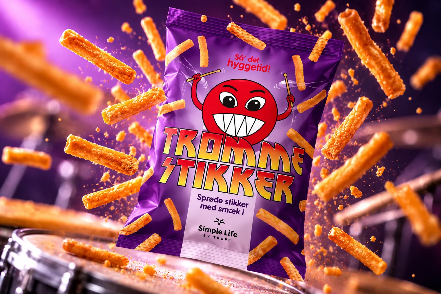
Trommestikker evolved into a small rock star with plenty of energy and attitude.
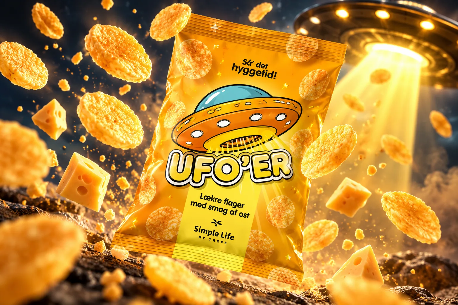
UFO’er took its cue directly from the name and became a playful science-fiction universe built around a flying saucer.
Each character was illustrated specifically for the packaging, giving every product its own identity while keeping the collection within one recognisable visual language.
Colour, character and shelf impact
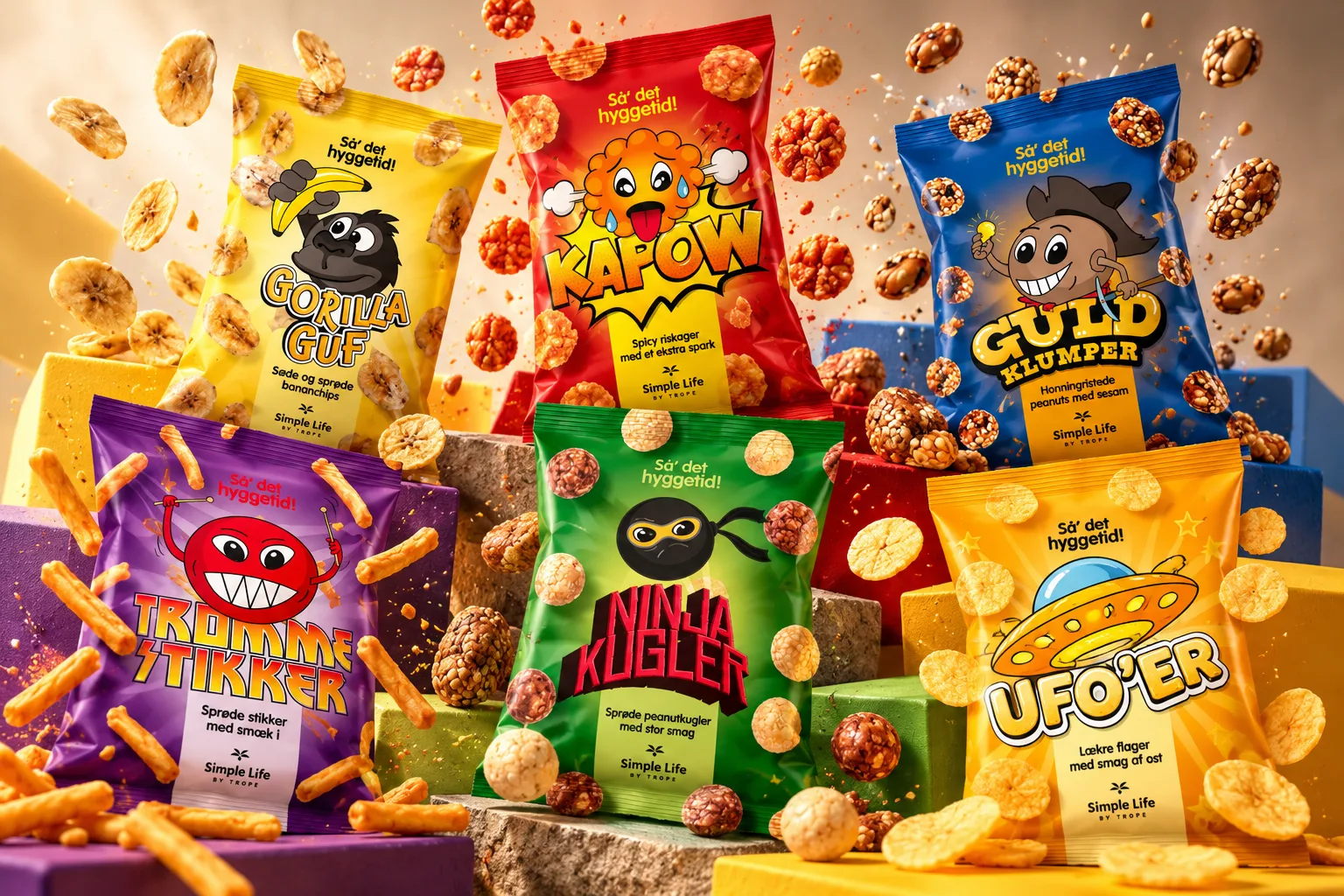
The six variants were designed to stand apart individually while still reading as one coherent series.
Each product received its own dominant colour, character and energy. Together with a consistent packaging structure, strong typography and recurring graphic elements, this created a clear family resemblance across the range.
The visual language was deliberately colourful, humorous and lively. The intended feeling was less “serious snack brand” and more “fun find that comes home for Friday night, movie night or the family table”.
From design to shelf
The final result was a fully produced series of six packaging variants that reached Rema 1000 stores across Denmark.
I supplied the finished artwork ready for production. The client was responsible for the commercial launch, sales, distribution and marketing of the products.
The brief
Simple Life by Trope wanted a completely new and playful take on a range of snacks covering banana chips, honey-roasted peanuts, spicy rice cakes, crunchy peanut balls, crunchy corn and potato sticks, and cheese-flavoured chips.
The products were developed as spot products for Rema 1000, so the packaging needed to be highly visible in-store and appeal to a younger audience. The ambition was to create bags that were difficult to ignore — the kind of products parents might find hard to leave behind.
My role
I developed the graphic expression for the entire six-product series in close collaboration with the client.
My role covered the project from early naming and visual development through to final production artwork:
- Product naming developed together with the client
- Overall visual expression and tone of voice
- Character development and illustration
- Typography and colour selection
- Packaging design and layout across six variants
- Final artwork and print-ready files
The client handled proofreading, sales, distribution and the subsequent marketing of the products.
The goal was simple: make the snacks impossible to overlook.
One series. Six personalities.
The product names became the starting point for the characters and visual worlds.
Gorilla Guf became a playful gorilla holding a banana.
Guldklumper turned into a gold prospector searching for his next find.
Kapow! was built around an overheated rice-cake character reacting to the spicy kick.
Ninja Kugler naturally became a round ninja character.
Trommestikker evolved into a small rock star with plenty of energy and attitude.
UFO’er took its cue directly from the name and became a playful science-fiction universe built around a flying saucer.
Each character was illustrated specifically for the packaging, giving every product its own identity while keeping the collection within one recognisable visual language.
Colour, character and shelf impact
The six variants were designed to stand apart individually while still reading as one coherent series.
Each product received its own dominant colour, character and energy. Together with a consistent packaging structure, strong typography and recurring graphic elements, this created a clear family resemblance across the range.
The visual language was deliberately colourful, humorous and lively. The intended feeling was less “serious snack brand” and more “fun find that comes home for Friday night, movie night or the family table”.
From design to shelf
The final result was a fully produced series of six packaging variants that reached Rema 1000 stores across Denmark.
I supplied the finished artwork ready for production. The client was responsible for the commercial launch, sales, distribution and marketing of the products.